Knowledge is key
Understand your user needs and content
HD, 4K, UHD, WUXGA or…?
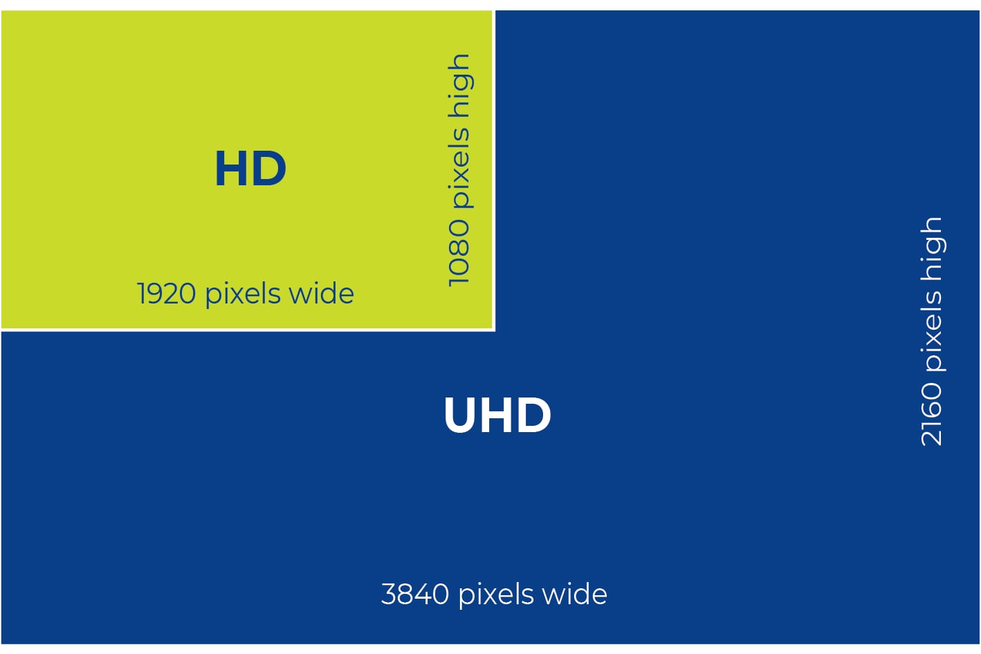
HD, 4K, UHD, WUXGA or…? While ultra-high resolutions are widely available, 4K is not always necessary – or even desirable. Using 4K without considering viewing distances and font sizes can result in content that is too small to read, even for those sitting at the front of the room.
So what resolution do you actually need? The DISCAS standard provides precise guidance, including the optimal font size required for readability from the farthest viewing point.
For most meeting, teaching, and presentation spaces, HD resolution (1920 x 1080 in 16:9 or 1920 x 1200 in 16:10) is typically sufficient. Higher resolutions such as 4K are primarily needed for high-detail content, including medical imaging, engineering design, or oil exploration.
It’s also essential to remember that a 4K display doesn’t automatically mean a 4K image. Any system is only as strong as its weakest link—if your source content, computer, or any part of the system is only HD, your display will only reproduce HD quality. A single HD pixel will simply be upscaled into a four-pixel block on a 4K screen. True 4K performance requires a fully 4K-compatible system from source to display.

Need guidance on choosing the right resolution for your next project?
Get Expert Advice
We are leading experts in projection system design. We use parametric 3D CAD and AV standards to design projection systems tailored to your exact requirements – considering display purpose, room layout, lighting levels, budget, and environmental targets. Trust us to deliver the best results every time.
Contact us for expert support today We’ll design your projection system for you!
Understand your user needs and content
Is it big enough?
What image quality is all about.
Is it too bright? Don’t design in eye-strain.
Can you see me at the back?
Design in your viewers’ comfort and the ability to concentrate.
Inspect what you expect.
