Knowledge is key
Understand your user needs and content
What image quality is all about.
Contrast is the most important consideration in delivering high-quality images in AV systems. Without proper contrast, visuals appear dull, lacking in brightness, color, and definition, resulting in a poor viewing experience.
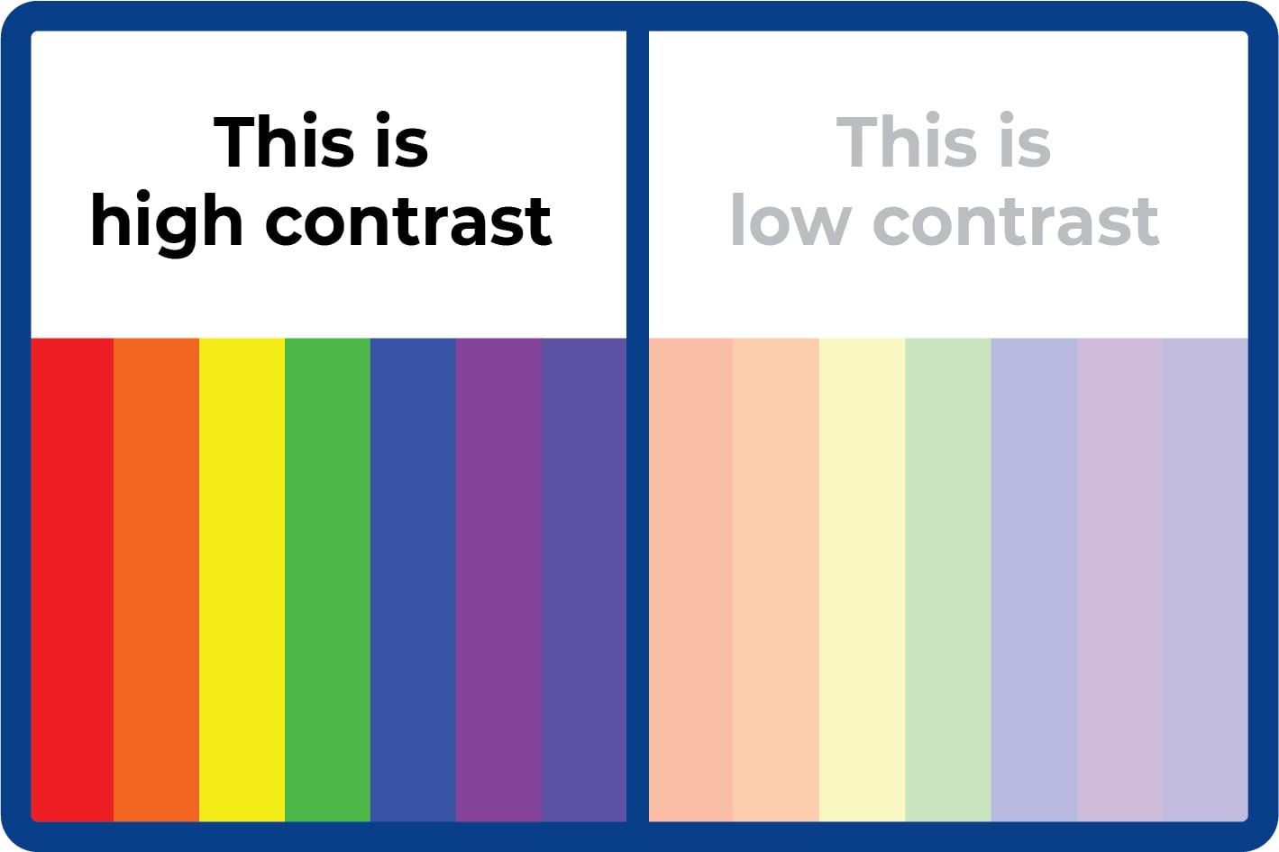
Contrast refers to the difference between the brightest whites and the darkest blacks in an image. A higher contrast ratio indicates a more dynamic and visually appealing image. For instance, a contrast ratio of 100:1 means the white areas are 100 times brighter than the black areas.
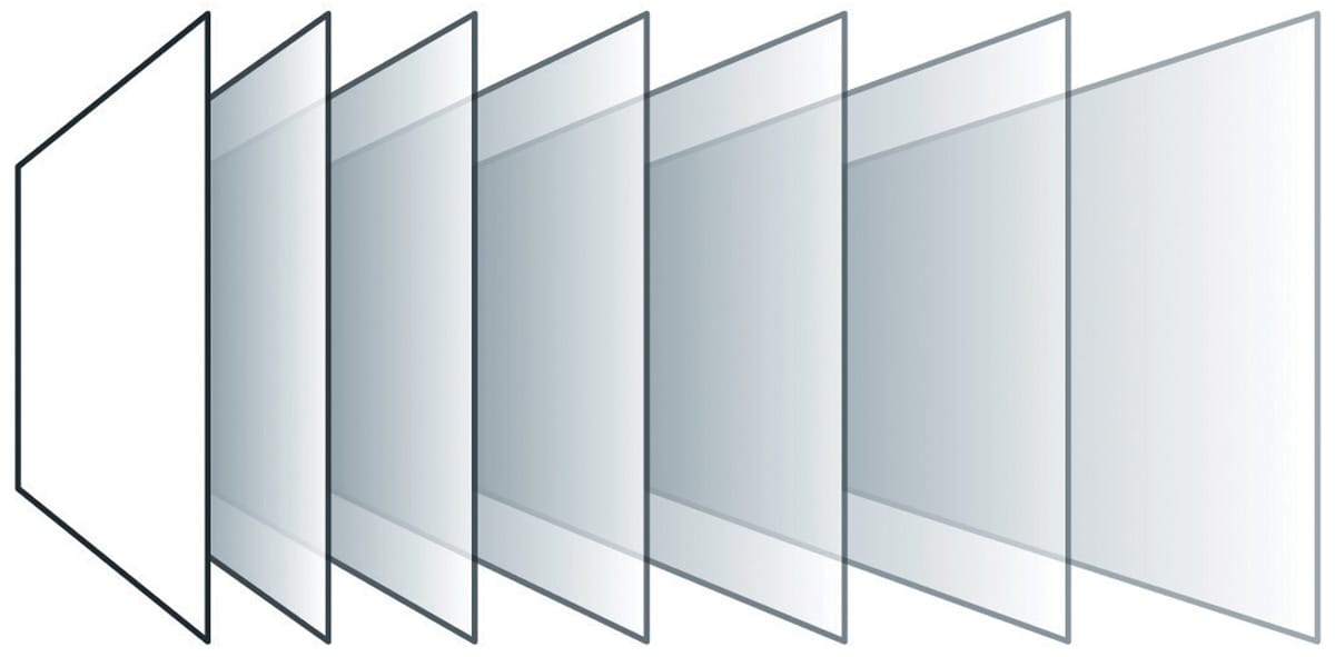
Brochure and spec sheet specifications typically highlight contrast ratios measured under ideal conditions, often using the “sequential method”. This involves measuring white and black levels at different times, which doesn't reflect real-world viewing environments. In practical settings, factors like ambient lighting significantly impact perceived contrast.
Image quality is effectively a function of image contrast. Not only does AVIXA’s mission-critical ISCR (Image System Contrast Ratio) standard address this, it also uses the correct type of contrast measurement (the method used in brochures and specification screens is not relevant to pro AV applications).
What is the difference in brightness between white and black image areas, on the same screen, at the same time?
And
What is the difference in brightness between white and black image areas in my client’s lighting and viewing conditions?
Assess the Environment: Evaluate the ambient lighting conditions of the installation space, as they directly affect image contrast.
Use the ISCR standard
Specify Appropriate Displays: Use ambient light-rejecting screens like our industry-leading VDL Supernova ALR screens that will deliver contrast ratios suitable for the intended environment and usage.
Our expertise in specifying and calibrating displays guarantees exceptional image quality and client satisfaction.
Need expert guidance on selecting the right display for challenging lighting conditions or Looking to enhance your AV system's performance? Our experts are here to assist you.
By focusing on accurate contrast specifications and real-world application, you can ensure that your AV systems deliver vibrant and engaging visuals, meeting and exceeding client expectations.
Check out our helpful Contrast Calculator below…
We are leading experts in projection system design. We use parametric 3D CAD and AV standards to design projection systems tailored to your exact requirements – considering display purpose, room layout, lighting levels, budget, and environmental targets. Trust us to deliver the best results every time.
Contact us for expert support today We’ll design your projection system for you!
Understand your user needs and content
Is it big enough?
HD, 4K, UHD, WUXGA or…?
Is it too bright? Don’t design in eye-strain.
Can you see me at the back?
Design in your viewers’ comfort and the ability to concentrate.
Inspect what you expect.