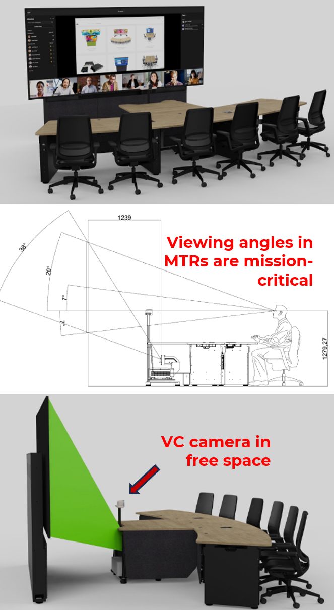
Image size is MTR design 101…
Microsoft Teams Room (MTR) display size and height from floor are critical factors in specification and positioning of video cameras.

Image size is MTR design 101. Get this wrong - and too many rooms do - and you’ve created cheap seats when only the people at the front can clearly see and engage with the main content window.
There is a sequence of design iterations to go through, starting with image size, but adding all the essential associated details such as avoiding neck strain by having the nearest viewers too close to the screen.
A breakthrough in MTR design came with the Signature Teams Room, where a small form factor VC camera was placed in free space in front of the screen. This broke the traditional clash between optimising display size and having the camera displaced too far.
The example here is the ProjecTABLE product, an Ashton Bentley design produced in collaboration with Visual Displays, using in-depth adoption of AVIXA’s DISCAS standard, whose task group I led more than ten years ago. (Keep an eye out for this as we’re updating it to reflect the evolution of displayed images we now use in Teams and all VC platforms.)
Aesthetics are important in MTR design. But this has to be founded on standards and the detailed design principles and best practices that are essential in the creation of exceptional user experiences.

Posted: 7th October 2024